Minimalism

Richard Serra "Right Angle Prop" 1969

Richard Serra "Strike: To Roberta and Ruby" 1969-1971
a. The of squares and rectangles are repetitive throughout his work.
b. Both pieces are very harmonious with the use of shapes and colors. They work good together.
c. In these pieces the repetition is somewhat interesting. I feel like they need something else to make them stand out to me even more

Frank Stella "Hiraqla Variation lll" 1969

Frank Stella "Damascus Gate l" 1969
a. The element of repetition are the bright colors he uses and some repetition in the choice of shapes.
b. The first piece would be in the middle of harmony and contrast because there are several shapes but the alignment of colors work good together. The second piece is also in the middle because the shapes work good but the colors distinguish between the shapes.
c. In the first piece the repetition of bright colors is what draws me to it, but then the arrangement of the center colors is kind of detracting. The repetition of shapes draw me to the second piece because of the way the colors form them.
Post Minimalism

Mona Hatoum "Incommunicado" 1993

Mona Hatoum "Untitled (Wheelchair)" 1998
a. The amount of curved and straight lines in each pice make them both repetitive.
b. Both pieces are harmonious because you would expect both thing to be made out of that material and you automatically recognize them because of there shape.
c. The repetition of all the lines is interesting in both work because the way they interact with each other to form each piece is unique.

Keith Milow "Twentieth Century X" 1994-1998

Keith Milow "NASH CROME" 1994
a. Color, texture and text are repetitive throughout each piece.
b. The first piece is harmonious because it is clean and draws you in with the text, but the second piece is not as harmonious because it is an odd shape and is more stylized.
c. The repetition of circles and text in the first piece really draws me to it because I want to see what it says. The second piece just seems boring to me because of the the large text and the piece doesn't have much on it.
Abstract Expressionism

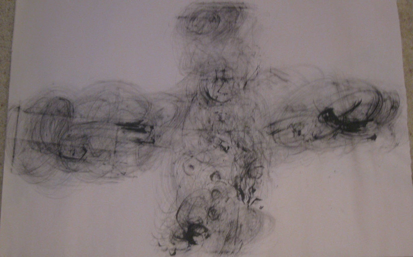
Robert Motherwell "Africa 1" 1970

Robert Motherwell "Africa 6" 1970
a. The use of the media and the technique of making these marks are repetitive
b. Both of these pieces are contrasting because they are very abstract and you really have to look at them to understand them.
c. The repetition of media and the forms it makes in both pieces is very interesting. I think it is interesting how you can manipulate the media like this.

Mark Tobey "Composition" 1961
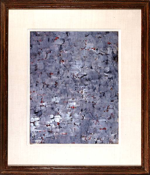
Mark Tobey "Lake" 1959
a. The use of strokes and colors are repetitive in both pieces.
b. Both of these pieces are also contrasting because of the abstraction but the colors harmonize a little bit.
c. The repetition and use of colors is very interesting in both pieces because once you look at the piece and then the title you can understand how he used the media and got the title.
Today

Greg Bell "Drip" 2005

Greg Bell "Frigate" 2005
a. Color and alignment are the main repetitive elements in these works.
b. These pieces have harmonious colors but have contrasting placement so they are both in the middle of the scale.
c. The repetition of color is the only interesting in this piece for me because it is simple and clean.

Ryan Coover "Zippy Zappy" 2006

Ryan Coover "Rain Drop & Puddle" 2010
a. Use of shapes and lines are repetitive in both pieces of work.
b. Again, both pieces have harmonizing colors and the placement is contrasting. so they are both in the middle of the scale.
c. The repetition of shapes and lines in both pieces is interesting. I like both pieces very much because of the direction of lines and the placement of each circle.