My Blog List

Sunday, October 31, 2010

Self Portrait process

My first attempt with a square and jacks.  The jacks worked but the square didn't.

First attempt with a circle and jacks.  The jacks and circle worked good together but it needed something else.

Second attempt with a circle and jacks.  The jacks and circle worked good together but it needed something else. I added my other object which is pipe cleaners.  It kind of worked but not totally.  

Final Poster & Large Book

Mark making sketches for stab binding book.  

Final 36x54 poster that I thought turned out really good on the heavy matte paper.  

Tuesday, October 26, 2010

10/22/2010 Lecture

Surrealism features- less political, new psychological theories of Sigmund Freud, 1899 the interpretation of dreams, access to the subconscious mind

artists- Max Ernst, Rene Magritte, Salvador Dali, Giorgio De Chirico, Man Ray

Automatism

ROY G BIV

Color Theory- The art and science of color interaction and effects.

Additive Color- Beams of light, red, green and blue.

Subtractive Color- When light is reflected of a pigment or dyed surface, red, yellow, blue

Process Colors- Cyan, Magenta, Yellow, Black

Color Overtones- A secondary hue bias in a primary color.

Achromatic-Black and White, no hue.

Color Interaction- The way colors influence one another.

Simultaneous Contrast- When a color affects its surroundings.

Bezold Effect- Demonstrates the influence of color interaction.

Opponent Theory- Cones can only register one color in a complementary pair at a time.

Afterimage- When you look at a red square for thirty seconds then look at a white sheet of paper, you will see a blue or green shape.

Hue- Name of color and location on color wheels.

Primary Colors- Red, Yellow, Blue

Secondary Colors- Green, Orange, Violet

Tertiary Colors- A mixture of a secondary color and an adjacent primary color.

Temperature- The heat a color generates.

Value- Lightness or Darkness of a hue.

Tint- Adding white to a hue.

Tone- Adding gray to a hue.

Shade- Adding black to a hue.

Intensity, Saturation and Chroma- The purity of a hue.

Monochromatic- Variations of a single hue.

Analogous- Adjacent colors on a color wheel.

Complementary- Opposite hues on the color wheel.

Split Complementary- Two colors on either side of one of the complements.

Triadic- Hues spaced equally on the color wheel.

Chromatic Gray- Mixture of several hues.

Earth Colors- Pigments usually found in soil, warm temperatures.

Disharmony- Used when the subject is disturbing.

Composition- Combination of multiple parts into a harmonious whole.

Accent Colors-

Color Key- Dominant Color.

Sunday, October 24, 2010

Color Swatches

http://kuler.adobe.com/#myKuler/themes

1. "The Business Man" Profession/Business Man

2.  "Its A Boy" Gender/Boy

3.  "Time For Autumn" Season/Autumn

4.  "He Is Sad" Mood/Sad

5.  "On Fire"  Temperature/Hot

6.  "He is sad" Mood/Sad

Thursday, October 21, 2010

Lecture 10/15/2010

Dada, Surrealism, after

Dada- social order, society, war, protest against

Contributions- appropriation, assemblage, construction, conceptual art, chance

Some Artists- Hugo Ball- 1916 Cabaret Voltare
                       Jen Arp
                       Kurt Schwitters
                       Marcel Duchamp

Conceptual Art- appropriation

Berlin- 1913
Paris- 1924 Surrealism

Module Madness Critique

Everyone liked how the piece stood and how it looked like it was going to fall.  They also like the use of the glue strings but it might need a little more of them.  Bill thought that some parts of it were being smashed to much and I should try to add some more to it.  that was the reason I didn't, I didn't want it to get smashed more than it already was.  Overall, the group thought it was a good piece.  

All Posters and Final Two

Here are all 50 of my mark making posters.  I think most of them turned out good.  I narrowed them down to 25 to add text to then to my final 10.

This poster was made with the roses. I changed the arrangement of the text to put in the book.

This poster was made by dragging a sheet of paper across the page.  I also changed the arrangement of text to put in the book and to make the large poster.

For the critique, the group quickly narrowed it down to about four posters.  Then they narrowed it down to these two after saying that the marks fit well with the text arrangement.  They also thought that the marks were well made and the text was very readable and simple.  I took the suggestion from Kathy to use a single line of text instead of several in the first poster.  another suggestion was to move the text closer together to make it more like a sentence.  After making the changes, I saw that it made a big difference. 


Sunday, October 17, 2010

10 Mark Making Posters With Text


Module Madness Process


I started off by gluing the q-tips together to form cubes.


Then I randomly placed them on top of each other to make the non-representational piece.

Here was almost my final piece until I had to turn it around to add four more cubes.  I turned it around and when I put it down, the three cubes used for the base collapsed.


This is what I ended up with.  I used the four cubes I needed to add as a base to help support the entire piece.  With the piece collapsing, it created a more unique and non-representational object. 

Tuesday, October 12, 2010

Mark Making Device and Ideas


I wasn't able think of many ideas for one material use, so I came up with 5 ideas for a few materials that worked the best and created the best designs.


dowel rods, wooden base and roses

Device after being used.  The marks were similar to my first marks.


Thursday, October 7, 2010

Artist Repetition

Minimalism

 Richard Serra "Right Angle Prop" 1969

Richard Serra "Strike: To Roberta and Ruby" 1969-1971

a.  The of squares and rectangles are repetitive throughout his work.
b. Both pieces are very harmonious with the use of shapes and colors.  They work good together. 
c. In these pieces the repetition is somewhat interesting.  I feel like they need something else to make them stand out to me even more

Frank Stella "Hiraqla Variation lll" 1969

Frank Stella "Damascus Gate l" 1969

a.  The element of repetition are the bright colors he uses and some repetition in the choice of shapes.
b.  The first piece would be in the middle of harmony and contrast because there are several shapes but the alignment of colors work good together.  The second piece is also in the middle because the shapes work good but the colors distinguish between the shapes. 
c.  In the first piece the repetition of bright colors is what draws me to it, but then the arrangement of the center colors is kind of detracting.  The repetition of shapes draw me to the second piece because of the way the colors form them.  

Post Minimalism

Mona Hatoum "Incommunicado" 1993

Mona Hatoum "Untitled (Wheelchair)" 1998

a. The amount of curved and straight lines in each pice make them both repetitive. 
b.  Both pieces are harmonious because you would expect both thing to be made out of that material and you automatically recognize them because of there shape.
c. The repetition of all the lines is interesting in both work because the way they interact with each other to form each piece is unique.

Keith Milow "Twentieth Century X" 1994-1998

Keith Milow "NASH CROME" 1994

a. Color, texture and text are repetitive throughout each piece.
b.  The first piece is harmonious because it is clean and draws you in with the text, but the second piece is not as harmonious because it is an odd shape and is more stylized. 
c.  The repetition of circles and text in the first piece really draws me to it because I want to see what it says.  The second piece just seems boring to me because of the the large text and the piece doesn't have much on it.  

Abstract Expressionism

Robert Motherwell "Africa 1" 1970

Robert Motherwell "Africa 6" 1970

a.  The use of the media and the technique of making these marks are repetitive
b. Both of these pieces are contrasting because they are very abstract and you really have to look at them to understand them.  
c.  The repetition of media and the forms it makes in both pieces is very interesting.  I think it is interesting how you can manipulate the media like this.   

Mark Tobey "Composition" 1961

Mark Tobey "Lake" 1959

a. The use of strokes and colors are repetitive in both pieces.
b.  Both of these pieces are also contrasting because of the abstraction but the colors harmonize a little bit.
c.  The repetition and use of colors is very interesting in both pieces because once you look at the piece and then the title you can understand how he used the media and got the title.  

Today

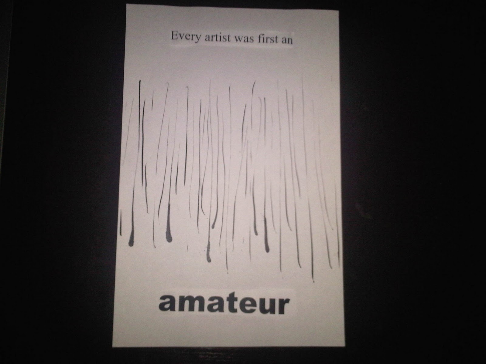
Greg Bell "Drip" 2005

Greg Bell "Frigate" 2005

a. Color and alignment are the main repetitive elements in these works.
b. These pieces have harmonious colors but have contrasting placement so they are both in the middle of the scale.
c.  The repetition of color is the only interesting in this piece for me because it is simple and clean.

Ryan Coover "Zippy Zappy" 2006

Ryan Coover "Rain Drop & Puddle" 2010

a.  Use of shapes and lines are repetitive in both pieces of work.
b.  Again, both pieces have harmonizing colors and the placement is contrasting.  so they are both in the middle of the scale.
c.  The repetition of shapes and lines in both pieces is interesting.  I like both pieces very much because of the direction of lines and the placement of each circle.